Introduction
Show me a marketing mix model and I’ll show you a deck slide with a smooth, monotone, gorgeously sigmoidal curve and a vertical line marking current spend. The story writes itself. You’re past the elbow, here’s where the next million should go, here’s the new optimum. Beautiful.
This post is for the people building and operating those models. I want to walk through why most of those curves are mostly the prior, not the data, and what to do about it in practice. The gap between “what the model knows” and “what the chart implies” is where most MMM rollouts quietly lose credibility. It’s also where the strongest practitioners separate themselves: not by hiding the gap, but by handling it on purpose.
I’ve been in this game since 2009. In GroupM, Blackwood Seven (acquired by Kantar) and now at Alviss AI I have looked at MMM rollouts week after week. The same traps keep showing up. They’re not really subtle. They’re just rarely named out loud, and rarely worked through end to end. So that’s what we’ll do here. Five traps, and for each one, the practitioner move that handles it.
Background knowledge
Before we get cracking it’s useful to revisit what the response curve we’re focusing on today is. It has many names and parameterizations but typically goes under the name of Hill. It’s parameterized by an \(α\) and a \(β\) corresponding to scale and shape respectively.
\[f(x;α,β)=\frac{1}{1+(x/α)^{-β}}\]
This is nice because \(α\) corresponds exactly to the point were saturation starts (for the second time). In other words where half of the potential has been reached. The best possible default for the shape parameter is 1 since that corresponds to a strictly degressive function. We will in the remainder of this post use a more classical formulation of the Hill function
\[f(x;K,s)=\frac{x^s}{K^s+x^s}\]
where K is the scale and s the shape. The parameterization I personally use is the former which corresponds to the CDF of the log logistic distribution. Now that’s for the response function, but the other important ingredient in modeling media is of course the lagged response which can be a simple koyck lag or something more elaborate like a convolution or a solow lag. I won’t dwell on those here but suffice to say that they don’t make the math easier. Now, let’s go!
Trap one: confusing the prior with the posterior
Most MMM is Bayesian these days, and rightly so. Still, the elephant in the room are often priors. They’re how you tell the model the things you already know, so it doesn’t have to invent them from a few years of weekly data. Without informative priors, an MMM with weekly data and a handful of channels is unidentified. Full stop. I’d much rather have a prior I can point to and defend than a flat assumption pretending to be neutral. So priors are a feature, not a workaround. The choice of prior is itself a modeling choice, and a perfectly good one when it’s grounded in something real.
The trap is not that we use priors. The trap is what happens when the chart on the slide hides which part of the curve came from the prior and which part came from the data.
For any Bayesian model with a half-identified parameter, the posterior of that parameter is dominated by the prior, with a nudge from the likelihood (Gelman et al. 2013). That’s the prior doing the job it’s supposed to do, in the regime where data alone can’t carry the weight. Saturation half-points are exactly that kind of parameter for most channels in most data sets. But why? Look at your data. A few years of weekly observations. A media variable that mostly increases over time, occasionally spikes around campaigns, and rarely if ever drops to zero. From that, you’re going to identify the curvature of a Hill function (Hill 1910)? The data alone won’t. The prior has to carry it, and that’s exactly what we want a prior for.
What you usually get on the slide, though, is a response curve presented as a clean read of the data, with credible intervals that look reassuring because the prior was tight. Tighten the prior, get a tighter posterior. It’s not magic. It’s the prior doing real work. The problem is presenting that as a finding the data produced, when most of it is human knowledge encoded as a probability distribution.
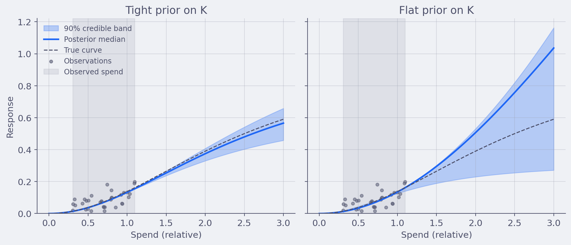
The fix is not “use weaker priors.” Weaker priors just make the posterior wider and the curve less informative. They don’t suddenly let the data speak louder than it can. The fix is two practitioner habits, both cheap, both diagnostic:
- Run a weak-prior sensitivity check. Refit the model with a deliberately weak prior on the saturation parameter alongside the production fit. Look at the two curves side by side. The gap is the prior’s contribution. That gap is information, not embarrassment, and you should be able to point to it when stakeholders ask “how do you know?”.
- Source every prior, in writing. For each informative prior, write down the reference data it came from. Past campaigns. Geo experiments. Calibration tests. Industry meta-analyses. A prior with a paper trail is doing principled work. A prior chosen because last quarter’s chart “looked right” is doing something else, and that distinction belongs in the model documentation.
At Alviss AI we run the weak-prior sensitivity check on every model build and surface the gap as a first-class output. It’s not embarrassment. It’s the honest version of the same posterior the production model is using.
Trap two: adstock and saturation are not separately identified
This one’s worse. Every introductory MMM blog post will tell you that adstock (Broadbent 1979) captures the carryover of advertising effects over time, and saturation captures diminishing returns within a period. Two different things, modeled as two separate transformations. Fine.
This is a computational issue since, from an identification point of view, adstock and saturation can substitute for each other in a lot of regimes (Naik and Raman 2003). A channel that looks saturating could equivalently be modeled as a channel with high carryover and weak saturation. The data, in many cases, just can’t tell you which is which.

You can prove this to yourself with a simulation in twenty lines of code. Generate data from one parametric combination, refit with a different one, and the fit is barely worse. Hierarchical pooling helps. Geographic variation helps. Brief but meaningful zeros and spikes in spend help. None of these are guaranteed to be in your data, and most platforms never show you what happens to identification when they aren’t.
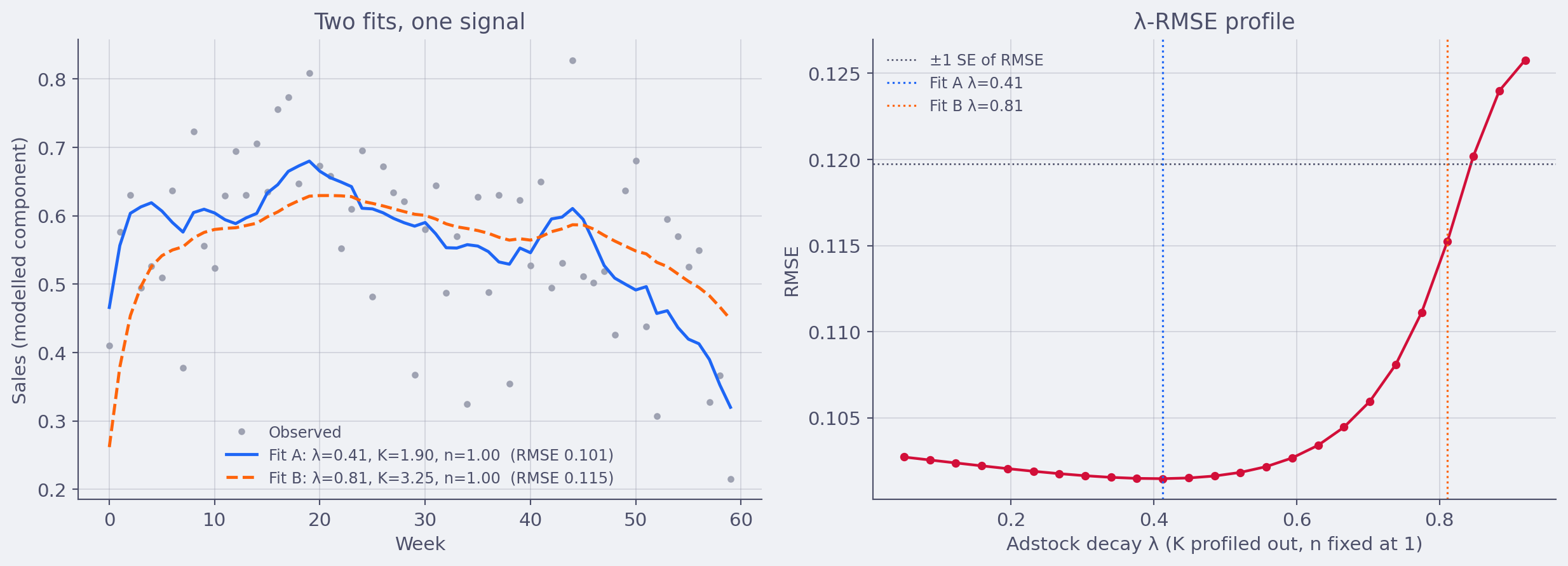
So when you look at your own MMM output and see a saturation curve and an adstock curve sitting side by side like two independent diagnostics, ask the harder question first. Did the data actually have the leverage to disentangle these, or did the prior do that work? In most weekly single-channel setups, the prior did the work, and that’s the only way the method can produce a finite-variance answer in that regime. The problem is when both quantities are presented as if they were two separate readings of the channel.
What the Alviss AI platform does is that it allows you to sample across all the plausible values of λ, K and n such that the uncertainty in the curve is well represented in the model uncertainty.
Trap three: optimizing on the posterior mean
Right, suppose you grant me trap one and trap two. The curve is mostly the prior, the decomposition is shaky. Even so, surely the mean curve is the best summary, and we should optimize on it?
No. This is the trap I find most expensive in practice.
A response curve has uncertainty. That uncertainty is not symmetric in business consequences. Spending past the elbow into a region where the model is mostly extrapolating is exactly the regime where the curve is least informed by data. The mean might say “you’d get 0.6 incremental conversions per euro.” The posterior might say “anywhere between 0.05 and 1.5 incremental conversions per euro, with most of the mass below 0.4.”
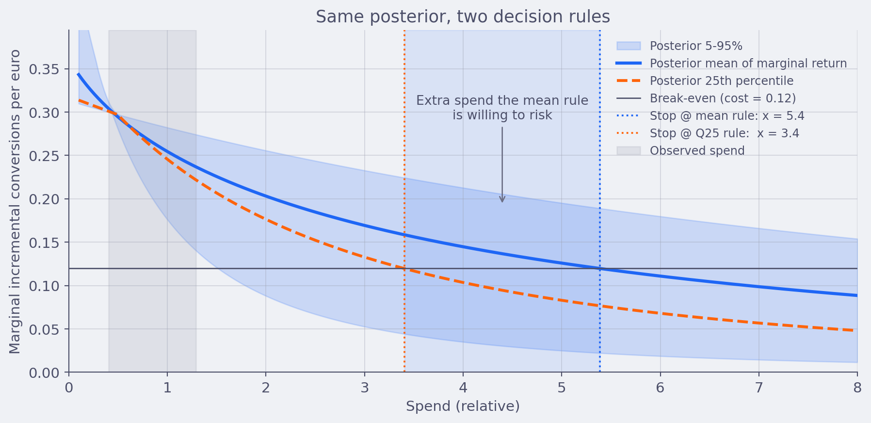
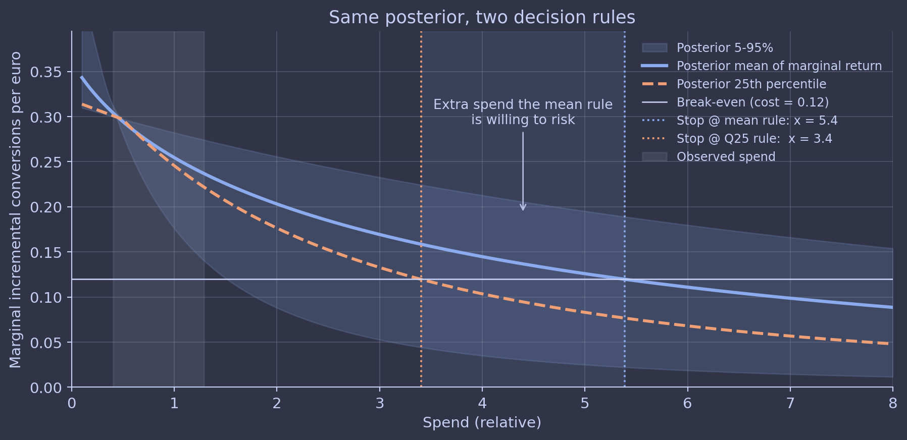
If you optimize on the mean, you take that bet. If you optimize on the full distribution and care about regret, you don’t.
This is what we mean when we say decisions deserve uncertainty estimates. Not “show me a credible interval next to the chart.” We mean the decision rule itself should be a function of the full posterior, not a function of a point estimate. The practitioner move is to write the decision rule down before generating the curve: are you maximising expected return, or minimising regret at the 25th percentile, or capping the probability of negative incremental ROI? Then run the optimisation against the full posterior under that explicit rule.
At Alviss AI the budget optimiser takes the posterior, the cost-per-conversion target, and a configurable risk attitude as inputs, and returns a decision under all three. The “stop @ mean” rule is one option, but it’s never the default and never the only one shown.
Trap four: parametric form as religion
Hill is fashionable. Michaelis-Menten is fashionable. Logistic is fashionable. They all look approximately the same in the part of the curve where you have data. They all behave wildly differently in the tails, which is exactly the part of the curve marketers actually care about.
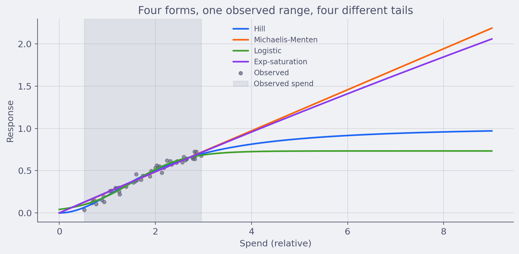
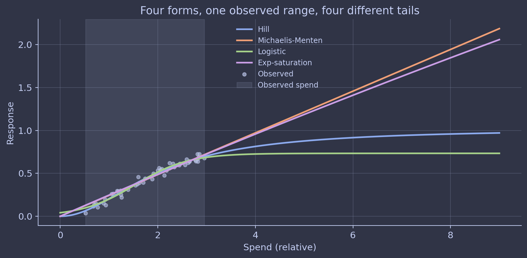
I’ve seen teams get into trench warfare over the choice of parametric form for saturation. (I’ve burned hours in those rooms myself. It almost never produces a better model.) The honest answer is that for most channels, your data identifies the part of the curve you’re operating on, and almost nothing about the tails. Picking Hill over logistic is mostly an aesthetic choice with material implications for the optimization output. That’s a recipe for overconfident decisions.
The practitioner move is to treat parametric form as itself uncertain. Two ways to do it: model-average across plausible forms with a Bayesian model-averaging weight, or use a flexible non-parametric component for the part of the curve actually identified by the data and a parametric extrapolation only outside it. Either way, the chart explicitly distinguishes the data-supported region from the extrapolated tail.
Trap five: the curve is not stable across regimes
A response curve is a snapshot of how a channel behaved during the period the model was trained on, conditional on the rest of the marketing mix during that period, conditional on macro and competitive backdrop, conditional on creative cycle. That’s a lot of conditionals.
Move any of those and the curve is allowed to move. New creative cycle? Probably moved. New competitor entering the auction? Moved. Macro shock that shifted consumer demand? Moved. Pricing change on the brand’s main SKU? Almost certainly moved.
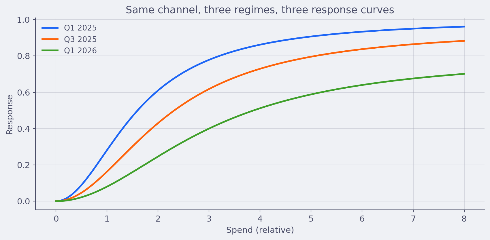
This sounds obvious when written down. In practice, plenty of teams treat last quarter’s response curves as a fixed planning artifact for next year’s budget. The curves get used in optimization runs that assume stationarity the world does not respect. I’ve seen budget allocations defended with curves that were six months stale and built on a competitive landscape that no longer existed.
The practitioner move is partly methodological and partly process. Methodologically: rolling refits, regime-aware hierarchical structure across time blocks, change-point detection that flags when the response is drifting. Process-wise: every response curve gets a “valid as of” date and a list of conditioning assumptions printed alongside it. Treat curves as perishable, not as ground truth, and refit on a cadence the business has agreed to upfront. At Alviss AI the platform refits automatically on a configurable cadence and flags channels whose posterior has moved more than a configurable amount since the last fit so the planner finds out before the next budget cycle, not after.
A practitioner’s workflow
If you take one thing from this, take this. Response curves aren’t really the output of MMM at all. They’re a posterior summary of a model whose identification is often weaker than the chart implies. The good news is that the practitioner has plenty of room to handle that explicitly and the team that handles it explicitly produces decisions that survive contact with reality.

Putting it together, here’s the workflow we use at Alviss AI and recommend for any MMM team:
- Run a weak-prior sensitivity check on every build. Produce the default-prior posterior and the weak-prior posterior side by side. Surface the gap as a first-class output. The gap is the prior’s contribution, and naming it is what separates honest modelling from theatre.
- Generate a channel-level identification report. For each channel, sweep the carryover parameter with saturation profiled out, and report the flat region of the loss landscape. Channels with a wide flat region get a calibration recommendation: a geo holdout, a planned dark period, or a calibration test, depending on what’s feasible.
- Write the decision rule down before optimisation. Decide whether you’re maximising expected return, minimising regret at a chosen percentile, or capping the probability of negative incremental ROI. Then optimise against the full posterior under that rule. Never the posterior mean by default.
- Treat parametric form as uncertain. Either model-average across plausible saturation forms, or use a non-parametric component for the data-supported region and explicit extrapolation labels for the tail. The extrapolated section of every curve should be rendered with widened bands.
- Refit on a cadence, with drift alerts. Pick a refit frequency the business agrees to upfront. Flag channels whose posterior has moved more than a threshold since the last fit. Treat last quarter’s curve as perishable, not as ground truth.
Each habit takes hours, not months. Together they turn the chart on the slide back into something the data can actually defend.
The reason we built Alviss AI the way we did is because the team genuinely believe this is the only way MMM stays useful. Bayesian rigor, agency-grade ergonomics, and an aggressive honesty about what the data does and does not tell you. We don’t think of that as a feature list. It’s the working definition of marketing science we operate by.
Conclusion
Response curves are the prettiest output in marketing mix modeling and the most overinterpreted. The shape you see on the slide is usually a mixture of three things. What the data actually identified, what the prior contributed, and what the parametric form forced. The practitioner’s job is to be honest about the recipe and to design the workflow so the honesty shows up in the artefact, not just in a footnote.
If the response curves coming out of your current MMM pipeline already survive the five habits above, you’re operating at a level most teams aren’t yet. If they don’t, the move is not to throw out MMM. The move is to wire the habits into the build process, channel by channel, until they’re cheap to run and impossible to skip. The curves get better. The decisions get better. The conversations with finance get a lot easier.